Lifescape
By Janet Armstrong,
Accredited Interior Designer, CAPS Certified
Fresh inspiration for your special spaces
As we look toward 2022 with new plans and goals, paint companies have identified colours of the year that deliver renewed hope and optimism and create calm, relaxed spaces. In addition to a specific colour, each has developed a palette of coordinating colours that allow you to plan a beautifully refreshed, coordinated and harmonized space.
The selection of colours is determined on the basis of a number of factors including sociological; economic; environmental issues and challenges; political climate; technology; and, exploration and science. The colour palettes released by the companies are created to support, reflect, foster the feelings people have about these issues and the results of changes and discoveries in each of these areas. So, what can we expect to see in colours for paint, furnishings, and decor accessories over the coming year? Read on for inspiration as you plan updates to your spaces in 2022.

Colour trends
When you look across the varied colours selected by the paint companies for their colour of the year, as well as the associated palettes, there is a broad range of choices. However, as I contemplate the colours from several of the brands, there are a number of common themes, ideas and inspirations that are consistent across them all. It goes without saying the past couple of years have been challenging for all of us and I would hazard to say challenging in both negative and positive ways.

You may have experienced social isolation, stress, fear and uncertainty that made you anxious to get on with things. On the other hand, you may have faced the challenge of assessing your home and lifestyle through a whole new lens. Our homes continue to be places of refuge, safety and comfort but they have also become offices, gyms and schools which have many of us rethinking our spaces and how they might do
double and in some cases triple duty. Nothing like necessity pushing us to be creative and innovative! Considering the good and bad together, we have contemplated and pressed reset on our priorities and goals as we start to move more freely, engage in social activities and set new routines for ourselves.
As we emerge from the stress of the past couple of years, we are seeking calm, comfortable, familiar colours, colours that will support and further our feelings of well being and sense of renewal. We are feeling more optimistic and energized and are looking for an infusion of colours that are lively, energetic and playful and these are the themes trending across a number of paint companies.

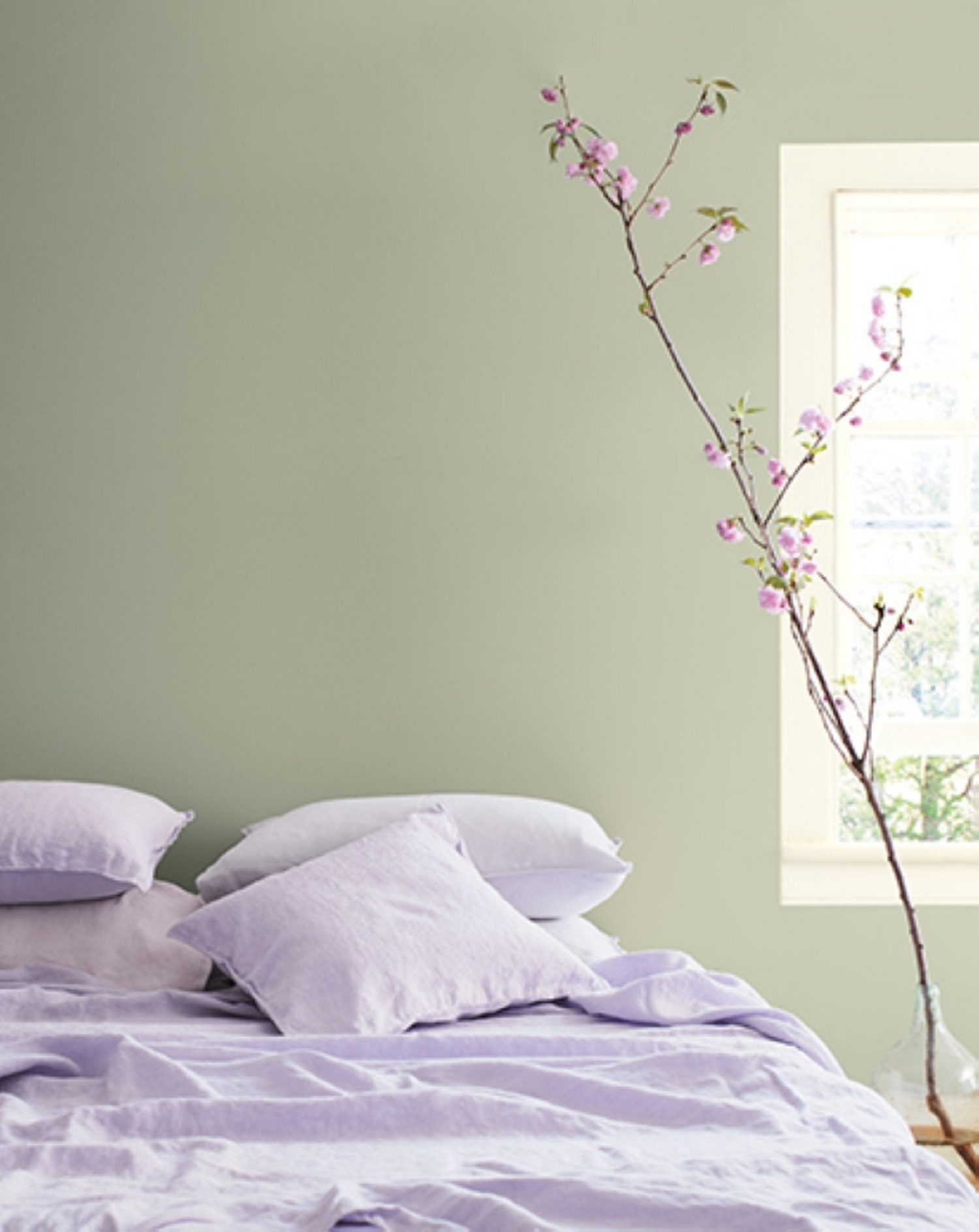
From Benjamin Moore, look to October Mist (CC-550), a “fresh, grounded, timeless colour that pairs well with a variety of other colours” (Benjamin Moore, October 13, 2021). The other colours in the palette are botanically focused and range from an energizing red (Wild Flower, 2090-40) infused with pinks and orange and a blue (Mysterious, AF-565) that can appear black or navy depending on the light, to lighter colours that reflect the colours found in nature, colours we associate with comfort. Being in nature brings a sense of calm tranquility
and Benjamin Moore’s colours of the 2022 palette are inspired by nature and the botanical elements found there.
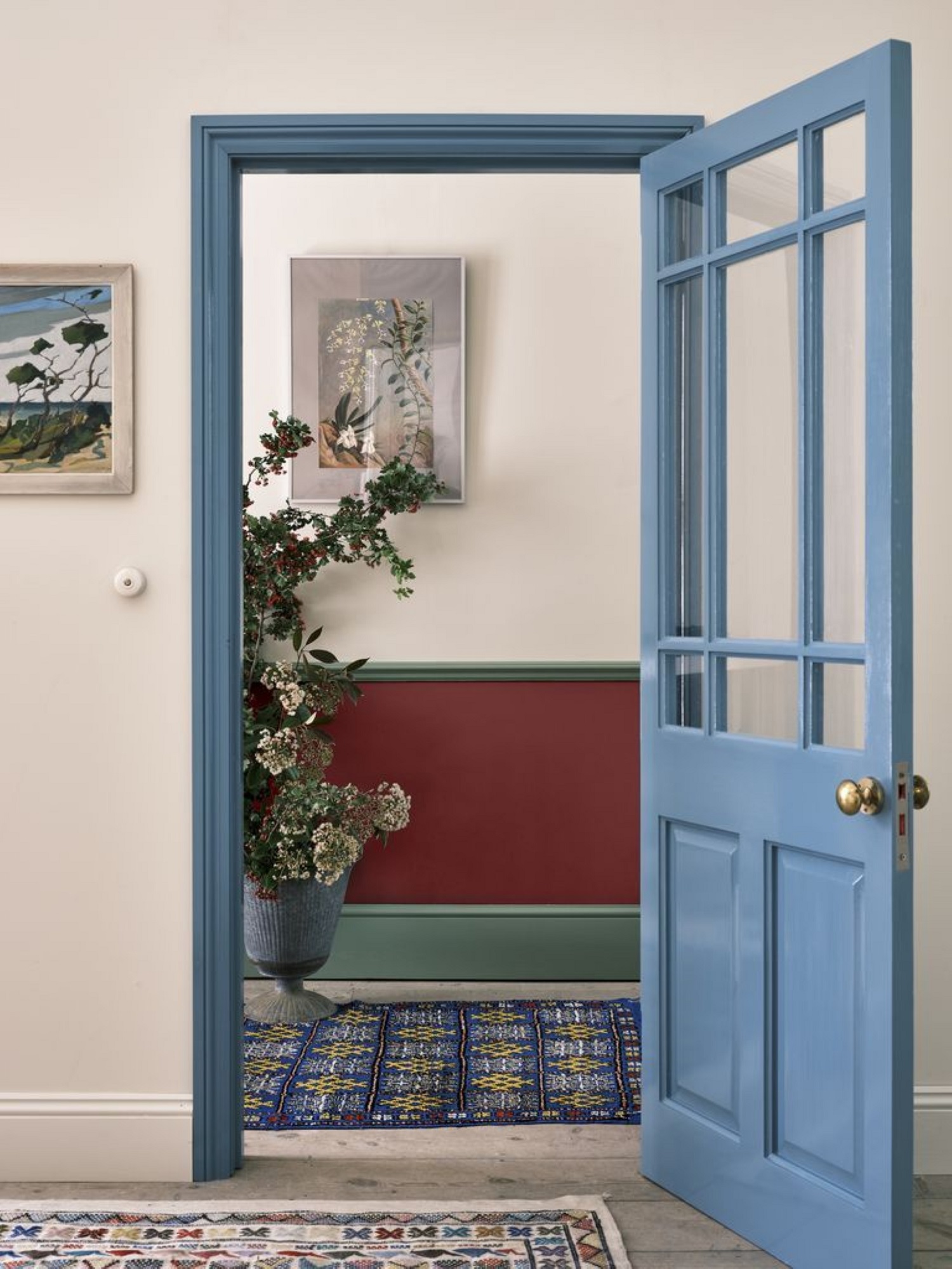
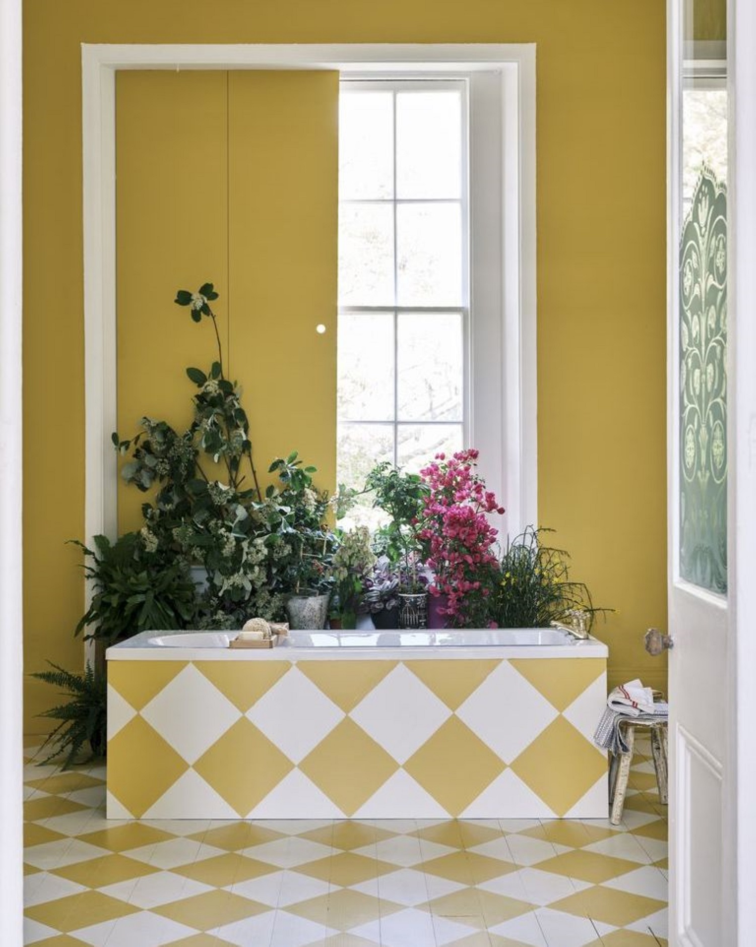
Farrow and Ball have selected colours for 2022 that are basic yet familiar colours that invoke feelings of comfort, confidence and nostalgia. Their palette of five colours provides enough variety that your spaces could be updated to feel dramatic, cheerful, playful, calming or bold depending on your choices and how you might combine the colours. Consider pairing warm Babouche (No. 223) with the rich crimson of
Incarnadine (No. 228) for a warm, energetic vibe. Or familiar, comfortable School House White (No. 291) with classic Stone Blue (No. 86) for a timeless look.
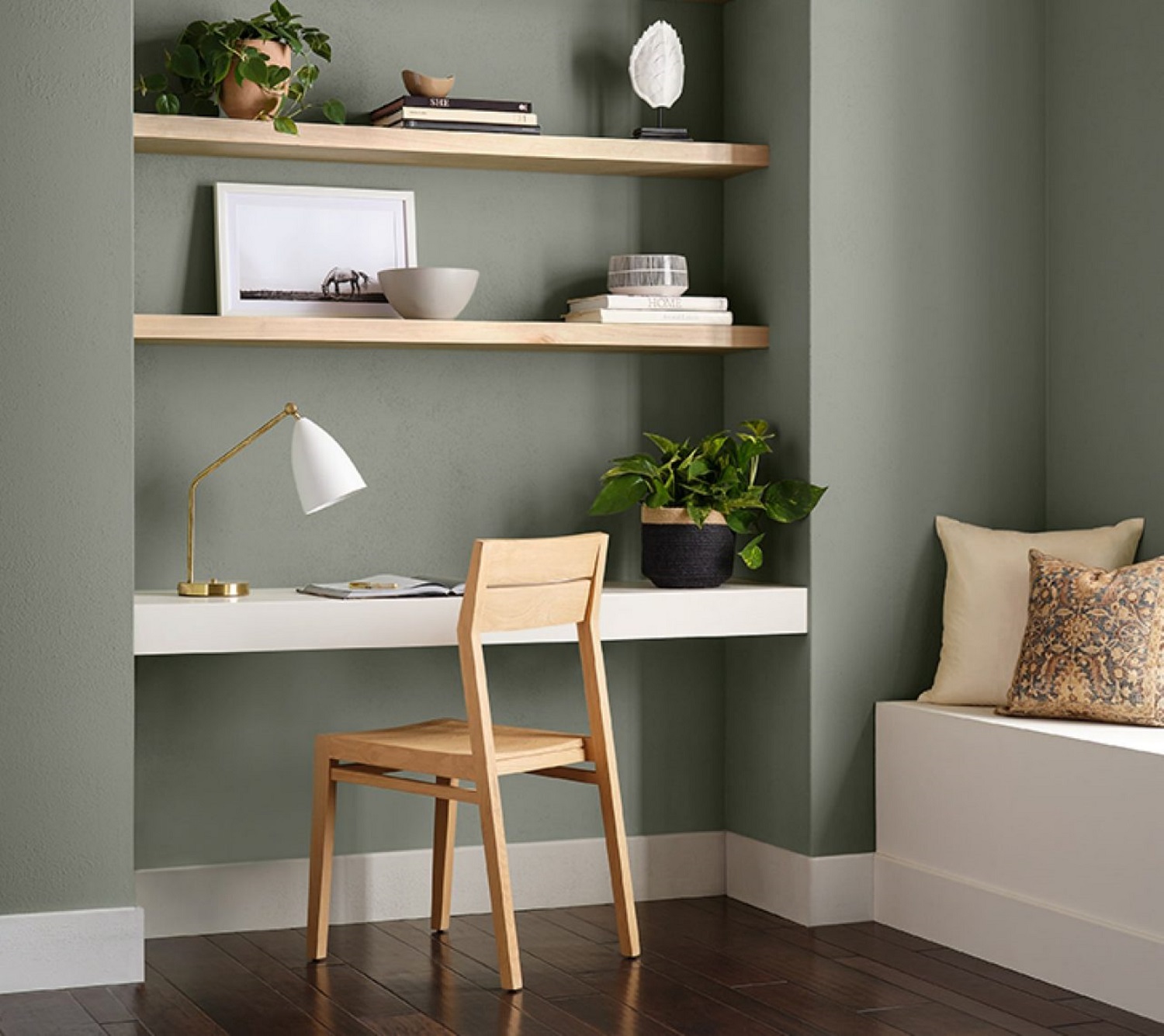
Sherwin-Williams colour of the year for 2022 is a comfortable, soft colour that is at once versatile and calming. Evergreen Fog (SW 9130) is a beautiful subtle colour of grey-green with a hint of blue. Its simple sophistication makes this a perfect statement colour for any space in your home and pairs beautifully with many other colours. Sherwin-Williams have also developed MODE, a collection of forty colours classified into four colour palettes, each indicative of the everchanging, ever-evolving nature of things as we settle into a new and dynamic way of living our everyday lives.

The four palettes of MODE are:
• Method — earthy, rich, warm colours reminiscent of the Art Deco era.
• Opus — deep tones reminiscent of dusk together with surprising accent colours, colours that will add drama and emotion to your spaces.
• Dreamland — as with the energy we experience at the beginning of a new season, the Dreamland colours inspire creativity, a renewed sense of ‘being’.
• Ephemera — the experience of the past couple of years has us reminiscing and longing for how things were. The colours in the Ephemera palette invoke feelings of what used to be while encouraging a great sense of optimism for our dreams of the future.
From calm, creative and contemplative to optimistic, energizing and lively, there is a broad range of colours to choose from for 2022. As you plan updates to your spaces, consider the vibe you want to bring to the space you are refreshing, the atmosphere you want to achieve. Even the addition of decor accents in one of the new colours will recharge and update your room, bringing renewed energy and optimism. Enjoy dreaming and creating as you move forward with hope, optimism and confidence.
Janet Armstrong (simplyswankdecor.ca) is a graduate of the Interior Design Institute of Canada, CAPS (Certified Aging in Place Specialist) and Chair of the Decorators and Designers Association of Canada (DDA Canada).


